Brand Design: Patient HQ
This project was unique from the very beginning. The client shared her personal story of surviving a traumatic accident and the long months of recovery that followed.
Her biggest challenge: Navigating a fragmented healthcare system where her medical records, appointments, and communications were scattered across different platforms. Too many passwords, redundant tests due to poor communication, and a sense of lost control over her recovery made the process overwhelming.
Patient HQ was born out of this frustration—a healthcare tech app aimed at developing a one-stop patient portal for long-term care. The vision was to streamline the healthcare experience by consolidating records, appointments, lab results, and messaging in one place.
My Role: Brand Designer
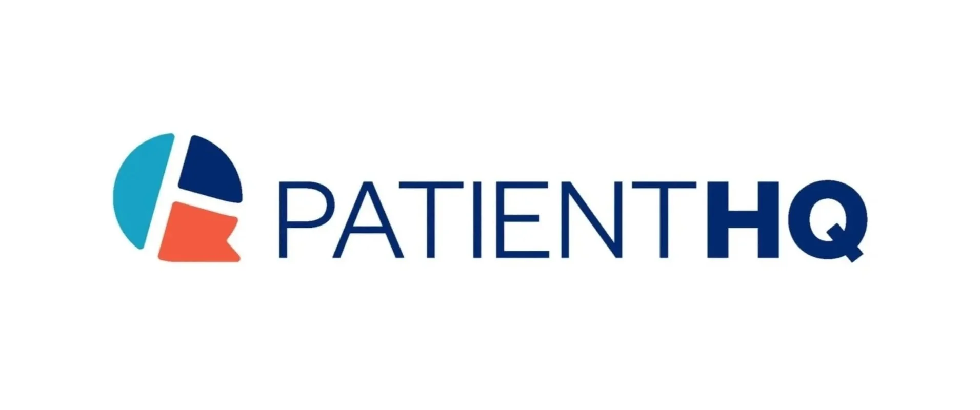

Logo
Patient HQ establishes connection and collaboration in the healthcare experience for clients. It was imperative to create a logo that felt friendly and welcoming while also representing the PHQ ethos. The result is a combination logo of a minimalist wordmark and a modern icon designed to stand out on any home screen.
The graphic combines the familiarity of a chat-message bubble with the letters “PHQ” to create not only a beautiful mark, but also one with strategy and meaning behind it.

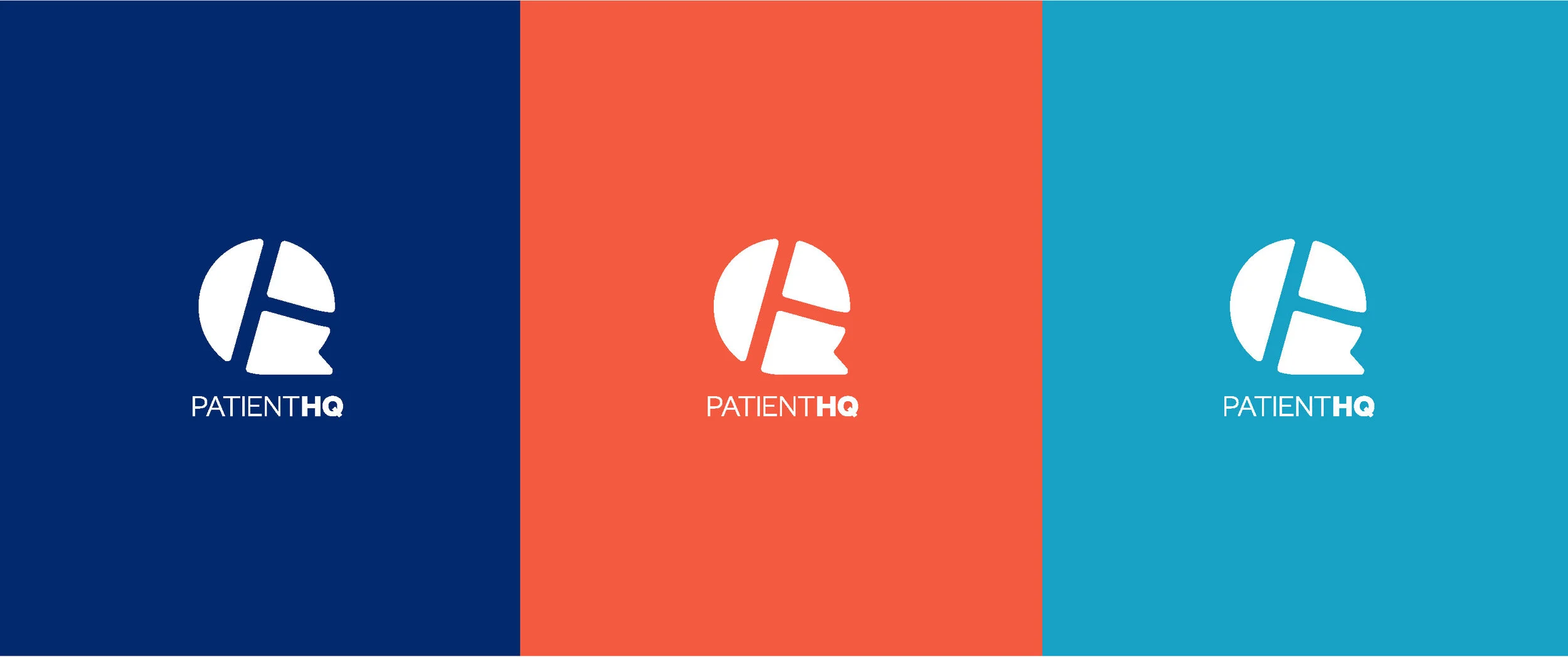
Colors
The color palette uses blue hues that are reminiscent of traditional health care but with an added vibrancy to give the identity more of a tech twist. The combination of blues and red-orange is a standout in the market and helps create distinction from its competitors.
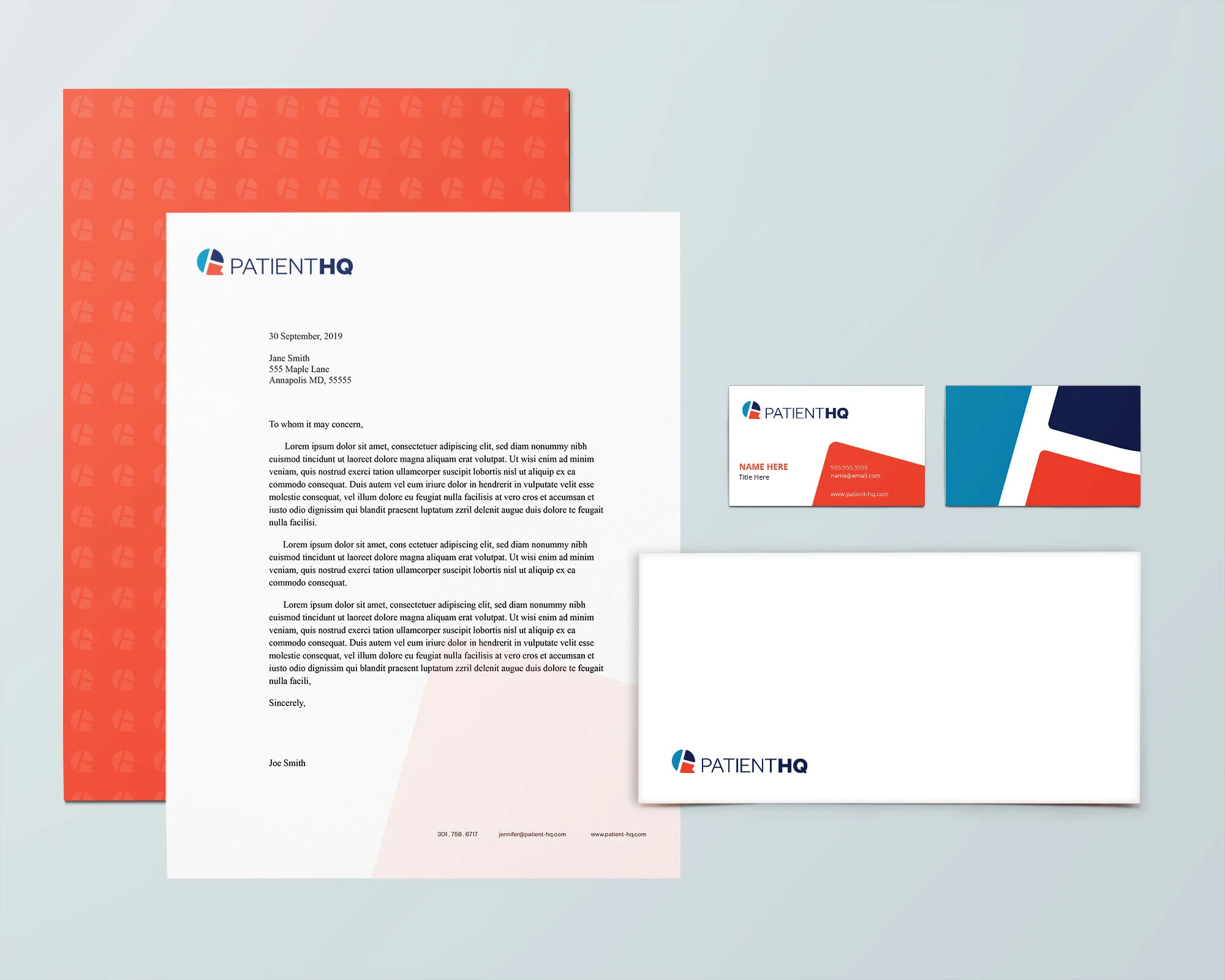
Brand Collateral
Standard stationery, such as business cards, letterheads, and envelopes, was designed leveraging scaled individual shapes of the primary logo to maintain clarity and consistency.
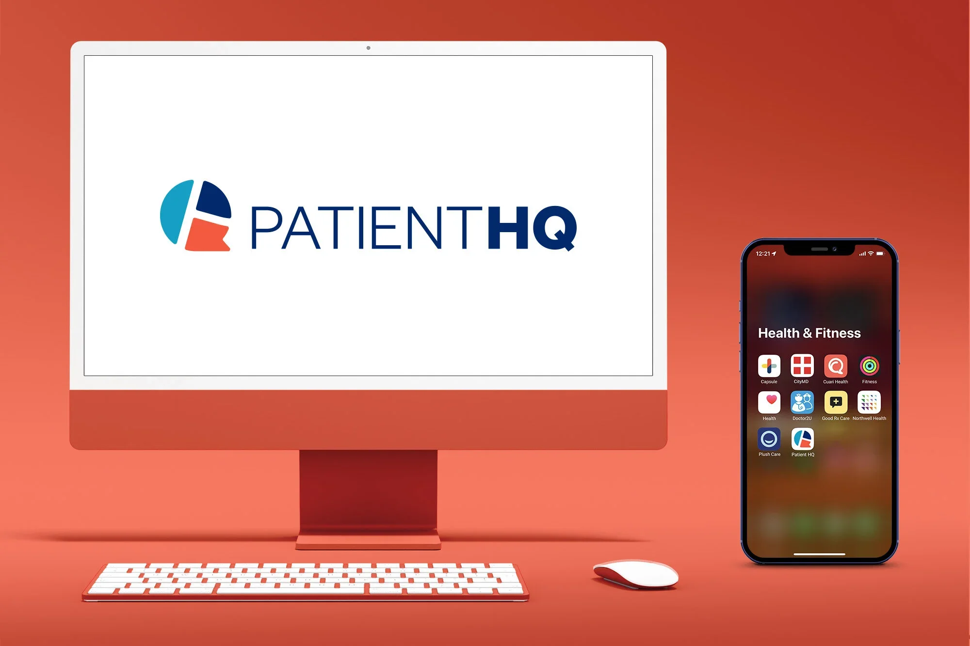
Although the brand was never launched, expansion of this project would have included:
Brand Messaging
Iconography
Website & App Design